AMX MIO-R4 Operation/Reference Manual
Touch panel design program (v2.10 or higher)
Hide thumbs
Also See for MIO-R4:
- Operation/reference manual (102 pages) ,
- Instruction manual (88 pages) ,
- Dimensional drawing (3 pages)

Related Manuals for AMX MIO-R4


Summary of Contents for AMX MIO-R4
- Page 1 Operation/Reference Guide TPDesign4 Touch Panel Design Program (v2.10 or higher) S of t w ar e L a s t R e v i s e d : 8 / 2 1 / 2 0 0 8...
- Page 2 LICENSE GRANT. AMX grants to Licensee the non-exclusive right to use the AMX Software in the manner described in this License. The AMX Software is licensed, not sold. This license does not grant Licensee the right to create derivative works of the AMX Software.
-
Page 3: Table Of Contents
Table of Contents TPDesign4 Program ...1 Overview ... 1 What's New in Version 2.10 ... 1 Supported Operating Systems ... 1 Supported Operating System Languages ... 1 PC Requirements ... 2 Supported Panel Types ... 2 Intercom Capabilities for Modero Panels ... 3 Supported Screen Resolutions ... - Page 4 Table of Contents TPDesign4 Project Files ...17 Overview ... 17 Inappropriate File Name Characters ... 17 Creating a New Project... 17 Using The New Project Wizard ... 18 System-Generated File Names... 20 Edit Focus... 21 Setting Project Properties ... 22 Project Properties dialog - Project Information tab ...
- Page 5 Errors and Warnings Report dialog ... 36 Working With Pages ...37 Overview ... 37 Creating a Page ... 37 Page General Properties... 38 Creating a Page Flip... 38 Drag & Drop To Set Page Flips ... 38 Page Flip Actions ... 39 Page Programming Properties...
- Page 6 Table of Contents Copying Popup Pages... 54 Pasting Popup Pages ... 54 Copying / Pasting a State From a Popup Page ... 55 Popup Page Groups... 55 Show/Hide Popup Pages ... 55 Deleting Popup Pages From a Project ... 56 Printing Popup Pages ...
- Page 7 List Box Buttons... 72 Adding Text to a Button ... 72 Additional Foreign Language Support ... 73 Pre-rendered graphics... 73 True Type Font Support ... 73 Changing Button Text Color ... 73 Adding a Bitmap to a Button ... 74 Adding an Icon to a Button...
- Page 8 Table of Contents List Box Buttons - Columns... 90 Setting List Box Button Column Properties ... 91 Setting General Properties: List Box Button Columns ... 91 Setting State Properties: List Box Button Columns ... 92 Adding Rows and Columns to a List Box (Managed Mode) ... 92 Adding Rows ...
- Page 9 ^LDD ... 104 Data List Commands - Rules ... 105 ^LDT ... 105 ^LDL ... 105 Command Structure List View Commands ... 106 ^LVO ... 106 ^LVL ... 106 ^LVP ... 106 ^LVS ... 107 ^LVC ... 107 ^LVF ... 107 Attaching a Dynamic List Data Table to a List Box Button ...
- Page 10 Table of Contents List Display ... 116 List Table Port ... 116 List Table Address ... 116 List Table Wrap ... 116 List Filter Column ... 116 List Managed ... 116 List Offset Enabled ... 117 List Preferred Row ... 117 List Preferred Row Height ...
- Page 11 Table of Contents Programming Properties... 121 Address Code ... 121 Address Port ... 121 Channel Code ... 121 Channel Port ... 121 Command Output ... 121 Command Port ... 121 Feedback ... 121 Level Aux ... 121 Level Code ... 121 Level Control Repeat ...
- Page 12 Table of Contents Address Codes... 123 Basic Address Codes: Date Display ... 123 Basic Address Codes: Time Display ... 124 Channel Codes ... 124 Navigation Buttons - Channel Code values ... 124 Basic Channel Codes: Page Flip... 125 NXP-PLV Reserved Channel Codes (1-7) ... 125 Level Codes ...
- Page 13 Working With The Property Painter... 130 Property Painter dialog ... 131 Saving a Properties Set ... 132 Working With States ...133 Overview ... 133 Setting State Properties ... 134 State Manager context menu... 134 Adding States To a Multi-State Button ... 135 Duplicating an Existing State on the Button ...
- Page 14 Table of Contents Working With Multiple Color Palettes ... 148 Creating New Palette Entries ... 148 Creating Custom Palettes... 149 Renaming Palettes... 149 Changing the Active Palette... 149 Importing Palette Files ... 149 Exporting Palette Files ... 150 Copying Palettes ... 150 Copying Palette Entries...
- Page 15 Creating G4 PanelBuilder Templates ... 174 Template Requirements ... 175 Required Template Elements ... 175 Optional Template Elements... 177 Element Specific Conventions ... 177 Rules for Navigating A Template ... 178 Template Wide Conventions ... 178 Creating Navigation Elements ... 178 Creating Placeholder Elements ...
- Page 16 Table of Contents Working With Dynamic Images ... 195 Adding Dynamic Image Files To Your Project ... 195 Assigning Dynamic Images to Slot Positions ... 195 Preserve Dynamic Images (Refresh only at Panel Startup) ... 195 Working With Dynamo Video ... 196 Setting Up a DynaMo Video Image ...
- Page 17 Receiving Files From The Panel ... 213 Virtual NetLinx Master USB Transfers... 213 Configuring the Touch Panel for Virtual NetLinx Master USB Transfers... 213 Configuring TPDesign4 for Virtual NetLinx Master USB Transfers ... 213 Transferring Files Using a Virtual NetLinx Master USB Connection ... 214 Sending Files To the Panel ...
- Page 18 Introduction ... 247 USB Stick Specifications ... 247 Pre-Configuration Procedures... 248 Updating AMX Hardware and Software... 248 Developing a TPD4 project with G4CC and TakeNote Support ... 248 Modifying the Source Code on your Master ... 249 Configuring Computer Control... 250 ...
- Page 19 Table of Contents Running the Computer Control Application ... 251 Running the TakeNote Application ... 251 TPDesign4 Touch Panel Design Software (v2.10 or higher) xvii...
- Page 20 Table of Contents xviii TPDesign4 Touch Panel Design Software (v2.10 or higher)
-
Page 21: Tpdesign4 Program
Overview The TPDesign4 Touch Panel Design (TPD4) program is designed to assist you in creating a state-of-the- art touch panel interface for AMX's G4 Level touch panels (see the Supported Panel Types section on page 2 for details). This instruction manual contains instructions for using TPDesign4, and describes the main elements of the program. -
Page 22: Pc Requirements
Note: If the scroll wheel on your Microsoft® IntelliMouse® doesn’t work with TPD4, try downloading the latest IntelliMouse drivers from Microsoft. Supported Panel Types TPDesign4 (v2.10 or higher) supports the following AMX (G4) touch panel types: Supported Panel Types • MVP-5100: •... -
Page 23: Intercom Capabilities For Modero Panels
Intercom Capabilities for Modero Panels Intercom-equipped Modero Panels support 2-way full-duplex intercom capabilities. These panels include: • MVP-8400i: 8.4" Modero ViewPoint (wireless) Touch Panel • NXD-1000vi: 10" Modero Touch Panel • NXD-700vi: 7" Modero Touch Panel Supported Screen Resolutions The application supports 24-bit RGB color at the following screen resolutions (based on Panel definition file information): •... - Page 24 TPDesign4 Program Refer to the online help for detailed descriptions of each menu item and toolbar button. In its default configuration, from top to bottom, left to right, the work area main components are: TPDesign4 Work Area Components Item • Title Bar •...
-
Page 25: Toolbars
Toolbars The toolbars in TPDesign4 are dockable, so they can be arranged within the application window (FIG. 2). To undock any toolbar, double-click anywhere inside the toolbar (but not on a toolbar button). Double-click again to dock the toolbar. To move the toolbar, click and drag using the handle (the single vertical bar) at the far-left side of the toolbar. -
Page 26: Design View Windows
TPDesign4 Program Design View Windows Design View windows represent pages or popup pages in the panel file you are creating. They provide a canvas upon which you may place buttons of any size that will fit within the confines of the windows. FIG. -
Page 27: Using The Zoom Controls
Select Layout from the Design View context menu to access the Layout sub-menu, containing options for layout/design control (send to front/back, align, center, etc). This menu is identical to the Layout menu, accessible from the main menu bar. Using the Zoom Controls The Zoom toolbar (FIG. -
Page 28: Workspace Navigator
TPDesign4 Program Workspace Navigator The Workspace Navigator is used to open the pages / popup pages in the file (establishing edit focus), and to view/edit the function codes associated with each page. The Workspace Navigator contains two tabs: Pages and Function Maps (FIG. 5). Pages tab FIG. -
Page 29: Properties Control Window
Properties Control Window Select View > Properties (or click the toolbar button) to display the Properties Control window (FIG. 6). Use the Properties Control window to view/edit page, popup page and button properties, and to view/edit the programming and states information associated with each element in your project. The Properties Control contains three tabs: General tab Programming tab... -
Page 30: State Manager Window
TPDesign4 Program State Manager Window The State Manager window (FIG. 7) is used to view/edit the various states of a selected button. Each state of the selected button is displayed as a thumbnail image in this window. To display the State Manager window, select View >... -
Page 31: Button Preview Window
Button Preview Window Select View > Button Preview to open the Button Preview window (FIG. 8). Like the other windows in TPDesign4, the Button Preview window is fully dockable, but initially it opens undocked. Double-click inside the title bar to dock the window. FIG. -
Page 32: Magnifier Window
TPDesign4 Program Magnifier Window The Magnifier window allows you to magnify a given area of a design view for temporary viewing in a separate floating window, without zooming the entire design view (FIG. 9). FIG. 9 Magnifier Window Select View > Magnifier Window (or click the toolbar button) to access the Magnifier Window. Right-click inside the Magnifier window to access the Magnify Control context menu, where you can select a zoom factor from 2 to 8 times actual size. -
Page 33: Default View
Default View In the default view (FIG. 10), it shows the current Cursor, and (for the button the mouse is over): Location, Size, and Feedback. FIG. 10 Status Bar - default view Cursor: Displays the current X-Y cursor position. Loc: Displays the X-Y location of the button that the cursor is over (relative to the upper-left corner of the page). -
Page 34: Print Preview Window
TPDesign4 Program Print Preview Window Select File > Print Preview to display a preview of the pages and popup pages in the active project, as they will appear when printed (FIG. 13). FIG. 13 Print Preview Window Each page and popup page in the project is printed one per page. The printed output maintains a constant scaling factor across all pages, with the image centered on the printed page. -
Page 35: Workspace Context Menu
The AMX WebUpdate program is a stand-alone application that communicates with the AMX website, allows a user to select from a list of available AMX Software programs to choose for updating, determines the latest version of the selected applications, returns a listing of available updates, allows a user to download the selected installation files, and upon request, launches the installation of those downloads. -
Page 36: G4 Panelpreview
G4 PanelPreview G4 PanelPreview is a stand-alone application (installed separately) from AMX that allows you to preview TPDesign4 projects for G4 touchpanels. To preview your panel project, select Panel > Send To G4 PanelPreview (or click the toolbar button) to launch the G4 PanelPreview application, where you can preview the project and simulate push and release of buttons, (including multi-state and bargraph buttons) via the mouse and keyboard on your PC. -
Page 37: Tpdesign4 Project Files
TPDesign4 Project Files Overview TPD4 Project (or Panel) files are created in the folder specified in the application preferences, unless you explicitly choose to save them in another location. Project Files contain all of the information required to define the user-interface that is displayed on the touch panel, including pages and popup pages and associated navigation/page-flip information, buttons including function code information, and all image and sound-related files that are used in the design. -
Page 38: Using The New Project Wizard
TPDesign4 Project Files Using The New Project Wizard The New Project Wizard steps you through the process of creating a new Project file (also known as a Panel file), complete with a start page. Use the New Project Wizard as a shortcut to starting new TPDesign4 projects. - Page 39 FIG. 16 New Project Wizard - Step 2 If the Use System Generated File Names option (in the Step 1 dialog) is not selected, this dialog is skipped since the information entered here would not apply. Fill out this information and click Next to proceed. If you choose not to populate one or more of these fields, they will not be included in the System Generated File Name.
-
Page 40: System-Generated File Names
TPDesign4 Project Files • Name: • Colors (Page background and Text): • Font: • Font Size: When you finish the New Project Wizard, note that the new project appears in the Workspace Navigator window (Pages tab). The initial page is listed under the Pages folder, and has the edit focus. You can change the target panel type for any existing panel file via the File >... -
Page 41: Edit Focus
The Purchase Order field and the (optional) Job comments field are not incorporated into the generated filename. Use these fields to enter this additional information for this project. All information entered in this dialog can be viewed/edited at any time via the Panel Properties dialog. -
Page 42: Setting Project Properties
27 for details. IR Emitters and Receivers tab: Includes Channel Port information for AMX IR Emitters, AMX IR Receivers and User (non-AMX) IR Emitters. See the Project Properties dialog - IR Emitters and Receivers tab section on page 28 for details. -
Page 43: Applying Password Protection To Your Project File
Project Properties dialog - Project Information tab • Job Name: • Designer ID: • Dealer ID: • Sales order: • Purchase order: • Created: • Modified: • File revision: • Revision date: • File name: • Job comments: • Protection: •... -
Page 44: Project Properties Dialog - Panel Setup Information Tab
TPDesign4 Project Files Locked - the next time the panel file is selected to open; the Enter Access Password dialog appears, prompting the user to enter the correct password to open the file. If the password is not entered correctly, the file will not be opened at all. These protection options are not Windows file attributes, and are only relevant within the context of the TPDesign4 application. -
Page 45: Setting A Power Up Page
The options in this tab include: Project Properties dialog - Panel Setup Information tab • Refresh Frequency: • Marquee Speed: • Panel Strings: • Power up page: • Power up popups: • Inactivity page: • Feedback blink rate: If you are using blinking button feedback in your project, use this field to specify the Setting a Power Up Page Use the Power-up page option in the Panel Setup Information tab of the Project Properties dialog to specify a particular page in your project to be displayed when the panel is turned on:... -
Page 46: Setting An Inactive Page Flip
TPDesign4 Project Files FIG. 23 Add Power Up Popup dialog To remove a popup from the Power up popups list, click the Remove Popup (X) button below the Power up popups field. 5. Click Apply to apply this change. Setting an Inactive Page Flip Use the Inactive Page Flip option in the Panel Setup Information tab of the Project Properties dialog to specify a particular page in your project to be displayed when the panel is inactive for a specified period of time:... -
Page 47: Project Properties Dialog - Sensors Tab
Project Properties dialog - Sensors tab Use the options in the Sensors tab of the Project Properties dialog (FIG. 24) to view/edit Channel/Level and Port settings for Light Sensors, Motion Sensors, Battery Levels and Cradle Sensors associated with the active panel file. FIG. -
Page 48: Project Properties Dialog - Ir Emitters And Receivers Tab
For example, the Modero CV7 panel has an IR receiver, but does not have an IR emitter. In this case, the only fields that are enabled in this tab would be the AMX IR Receivers (38KHz and 455KHz) fields, where you could specify a channel port assignment for either 38KHz or 455KHz IR reception. -
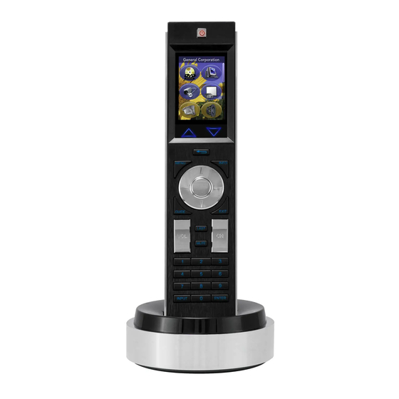
Page 49: Working With R-4 Remote Controllers
The IR receivers and transmitters on G4 panels share the device address number of the panel. Working With R-4 Remote Controllers AMX R-4 (ZigBee) Remote Controllers (FIG. 26) feature a color LCD touch screen that can be programmed and customized like any other touch panel type. FIG. 26... -
Page 50: R-4 Remote Devices - Unsupported Button Types
TPDesign4 Project Files 3. Select Next to proceed to the New Project Wizard - Step Two dialog (FIG. 16 on page 19). Fill in the fields in this dialog as desired. 4. Select Next to proceed to the New Project Wizard - Final Step dialog (FIG. 17 on page 19). Fill in the fields in this dialog as desired. -
Page 51: Undo/Redo Support
The Text setting is the replacement for the Quick Text Tool found in TPDesign3 Disabled - Disables the Quick Input option. Undo/Redo Support TPDesign4 supports full Undo / Redo functionality at the panel level. This means that each panel file that is open in the program maintains a separate undo/redo stack and manages this for the user. -
Page 52: Opening Pages/Popup Pages Via The Workspace Navigator
TPDesign4 Project Files FIG. 27 Workspace Navigator - Pages tab There are also a couple of actions that you can do simply by selecting an item in the tree and choosing the appropriate command or toolbar button: Opening pages/popup pages via the Workspace Navigator You can open a page or popup page in the Workspace Navigator by double-clicking on the page. -
Page 53: Cutting, Copying And Pasting
TPDesign4 Project Files FIG. 28 Function Maps tab Cutting, Copying and Pasting There are several items that can be cut, copied or pasted in TPDesign4. The ability to utilize these features effectively can greatly increase your productivity. The Copy and Paste functions in TPDesign4 always work on the element (including buttons, bitmaps, even individual button properties displayed in the Properties Control window) which has the current Edit Focus. -
Page 54: Cutting Objects
TPDesign4 Project Files Cutting Objects Cutting an object or objects is identical in nature to copying, with the exception that the selected object or objects will be removed. You may cut by selecting Edit > Cut from the main menu, using the Ctrl + X hotkey, or by clicking the Cut toolbar button. -
Page 55: Copying/Pasting Pages, Popup Pages And Buttons Across Projects
Copying/Pasting Pages, Popup Pages and Buttons Across Projects Open the Paste Control Options dialog (Button > Paste Controls) to specify whether to retain Function Codes (Address, Channel and Level codes), Page Flip Options, and Images/Slots/Sounds when the copied buttons are pasted into a page in a separate project. 2. -
Page 56: Errors And Warnings Report Dialog
TPDesign4 Project Files 3. Step 3 of 3 (Finish): The final dialog in the wizard lists the selected file, the original panel/ resolution association, and the target panel/resolution. Following the conversion process, any warnings and/or errors encountered will be displayed in the Errors and Warnings report dialog. Click Filter Warnings to select which warning messages to display or suppress (via the Filter Conversion Warnings dialog). -
Page 57: Working With Pages
Working With Pages Overview Pages are not only containers for buttons, but can also have up to one address port / address code and up to one channel port / channel code combination. Pages cannot have borders and possess only one state. You may place text directly on a page outside the context of a button. -
Page 58: Page General Properties
Working With Pages Because the RGB Color palette supports more colors than the Palette Index, you might see some slight variation in some colors if you switch from the RGB Color palette to Palette Index. In most cases, any variation that occurs in the translation is extremely subtle, since TPDesign4 tries to match the color exactly. -
Page 59: Page Flip Actions
Page Flip Actions With a button selected in a Design View window, click Page Flip in the Properties Control window (General tab) to open the Button Page Flip Actions dialog, where you can set the type of page flip to apply to the selected button, and specify the target page. -
Page 60: Page State Properties
Working With Pages Page State Properties Use the State tab of the Properties Control window to set/edit page state properties. The State tab contains a table that lists the page state properties for the active page. To edit any of the listed properties, click on an item in the right-hand column to activate the field. -
Page 61: Adding A Fill Color To A Page
Page State Properties (Cont.) • Sound: Adding a Fill Color to a Page To add a fill color to a page: 1. Create a new Page (Panel > Add Page), or open an existing one (via the Workspace Navigator - Pages tab). -
Page 62: Adding An Icon To A Page
Working With Pages If you don't see the desired image file listed in the Select Resource dialog, you need to import the image file into the project first. 4. Click Bitmap Justification (in the Properties Control window) to set the justification of the image on the page. -
Page 63: Supported Image File Types
FIG. 31 An icon that doesn't use transparent as the background color Obviously you don't want that unsightly box framing the icon! You need to edit the icon's fill color and make the background color transparent. With a transparent background color, the icon actually retains its original rectangular shape, but will display without the background (FIG. -
Page 64: Copying Pages
Working With Pages to click on the page (not on a button) to bring up the State Properties for the Page, and not a button on the page. 3. Select a video source from the list to apply the video fill to the Page. Copying Pages In the Workspace Navigator (Pages tab), at the top most level are Panel Names. -
Page 65: Deleting Pages From A Project
Deleting Pages From a Project To delete a page from the active project, select the page to delete in the Workspace Navigator (Pages tab), and select Edit > Delete. The program will prompt you to verify the page deletion first. All panels must include at least one page, therefore, deleting the last remaining page is not allowed. -
Page 66: Printing Pages
Working With Pages Printing Pages Select File > Print Preview to display a preview of the pages and popup pages in the active project, as they will appear when printed. Each page and popup page in the project is printed one per page. The options in the Print Preview window toolbar include: •... -
Page 67: Working With Popup Pages
Working With Popup Pages Overview Popup pages are similar to pages in some respects as they are a container for buttons, they may have up to one address port / address code and up to one channel port / channel code combination, and contain only one state. -
Page 68: Using The Popup Draw Tool
Working With Popup Pages The minimum size for popup pages is 15 pixels in height or width. You can also set the dimensions manually by dragging the sizing handles on the Popup. To resize the Popup manually, you must first enable the Show Popup Pages option in the Page menu. Once the Popup is displayed on the page, you can click and drag the red handles on the Popup to resize it manually. -
Page 69: Drawing Assist Support For Popup Pages
2. Left-click inside the desired page (in the active Design View window), and while holding the left mouse button down, drag to draw the popup page to the desired size and shape. The minimum popup page size is 15 pixels in height or width. When using the Button Draw or Popup Draw tools, hold down the SHIFT key while drawing to constrain the item to a square. -
Page 70: Popup Page General Properties
Working With Popup Pages Popup Page General Properties Use the General tab of the Properties Control window to set/edit popup page properties. The General tab contains a table that lists the properties for the active popup page. To edit any of the listed button properties, click on an item in the right-hand column to activate the field. Depending on the item selected, you can either set the item manually, select from a drop-down menu, or both. -
Page 71: Popup Page Programming Properties
Popup Page General Properties (Cont.) • Show Effect Time: • Hide Effect: Popup Page Programming Properties Use the Programming tab of the Properties Control window to set/edit popup page properties. The Programming tab contains a table that lists program-related properties (Address and Channel Port/ Channel Code assignments) for the active popup page. - Page 72 Working With Popup Pages Popup Page State Properties (Cont.) • Text Color: • Text Effect Color: • Overall Opacity: • Video Fill: • Bitmap: • Bitmap Justification: • Bitmap X and Y Offsets: (available only if the bitmap justification has been set to Absolute). To apply an X •...
-
Page 73: Adding A Fill Color To A Popup Page
Adding a Fill Color To a Popup Page To add a fill color to a Popup Page: 1. Create a new Page (Panel > Add Popup Page), or open an existing one (via the Workspace Navigator - Pages tab). 2. With the Popup Page selected, click on Fill Color, in the States tab of the Properties Control window to activate the browse button (...). -
Page 74: Adding Text To A Popup Page
Working With Popup Pages 4. Click Icon Justification (in the Properties Control window) to set the justification of the image on the popup. Select Absolute to manually position the image. Adding Text to a Popup Page Since G4 panels utilize address and channel port/address codes (and possess a single state), you can display text directly on a Popup Page in your project. -
Page 75: Copying / Pasting A State From A Popup Page
3. the folder named Popup Pages. Pasting a popup page onto another page or popup page in the Panel Navigator (which is only a paste target for buttons) or onto the folder named Pages (which is for pages only) is not allowed. Copying / Pasting a State From a Popup Page Copying a state from a popup page is possible by selecting the desired states in the State Manager then either clicking Edit >... -
Page 76: Deleting Popup Pages From A Project
Working With Popup Pages To hide a selected Popup Page: Select a Popup Page in the Popup Pages tab of the Workspace Window, and select Hide Popup Page (or click the toolbar button). To hide all Popup Pages: Select Hide All Popup Pages in the Page menu, Design View context menu, or click the Hide All Popup Pages toolbar button). -
Page 77: Working With Buttons
Working With Buttons Overview TPDesign4 supports the following button types: General: Basic dual-state buttons that can be used for most touch panel functions, not associated with any specific functionality (see General Buttons section on page 69 for details). Multi-State General: Basic multi-state buttons that can also be used for most touch panel functions, and support up to 256 states. -
Page 78: Setting Default Parameters For New Buttons
Working With Buttons With an item selected in a Design View window, hold down the CTRL key while moving the item with the keyboard arrow keys to move by the grid size instead of a single pixel (regardless of the grid visibility or snap to grid setting). Holding the CTRL key while resizing the selected items with the keyboard will resize by the grid size. -
Page 79: Creating New Buttons
On/Off State Font type FIG. 37 Drawing Tools Toolbar elements Select View > Toolbars > Drawing Toolbar to show/hide this toolbar: • On/Off State: • Button Style drop-down: Click the down arrow to view a list of all available button types. The •... -
Page 80: Using The Drawing Assist Features
Working With Buttons 3. Hold down the left mouse button and drag the mouse diagonally. You will see a sizing rectangle as you drag the mouse, indicating the size of the button you are drawing. Hold down the SHIFT key while drawing to constrain the button to a square. With an item selected in a Design View window, hold down the CTRL key while moving the item with the keyboard arrow keys to move by the grid size instead of a single pixel (regardless of the grid visibility or snap to grid setting). - Page 81 Drawing Assist Tools (Cont.) Button(s) Button Name Align: Left, Horizontal Center, Right, Top, Vertical Center, Bottom Center Horizontal/Vertical Make Same Width/Height/Size Size To Image Aspect Ratio Horizontal Spacing (Equal, Increase, Decrease, Remove) TPDesign4 Touch Panel Design Software (v2.10 or higher) Working With Buttons Description Use the Align commands to quickly align selected...
-
Page 82: Alignment & Sizing Tool
Working With Buttons Drawing Assist Tools (Cont.) Button(s) Button Name Vertical Spacing (Equal, Increase, Decrease, Remove) Make Ideal For Border Increase/Decrease Width/Height For Border Alignment & Sizing Tool Select Layout > Alignment & Sizing to open the The Alignment & Sizing dialog. The options in this dialog offers additional design tools (FIG. - Page 83 Horizontal - select the type of horizontal alignment to apply to the selected buttons: • none: • left edges: • centers: • right edges: • left edges to right: • right edges to left: • left to right spacing: Aligns the left edge of the first selected button to the right edge of the •...
-
Page 84: Generated Button Names
Working With Buttons Sizing - These options allow you to resize the selected buttons to make them match in width, height or both. Note that the order in which the buttons are selected in the Design View window controls how several of these options work. •... -
Page 85: Setting General Button Properties
Working With Buttons Setting General Button Properties Once you have created a new button, you can use the General tab of the Properties Control window (FIG. 40) to set/edit general (non-state oriented) button properties. The General tab contains a table that lists the button properties for the selected button type. -
Page 86: Setting Button Programming Properties
Working With Buttons Setting Button Programming Properties Once you have created a new button, you can use the Programming tab of the Properties Control window (FIG. 41) to view/edit programming-related information for the selected button. This information is displayed in a table format, similar to the General tab. FIG. -
Page 87: Setting State Properties
Setting State Properties Once you have created a new button, you can use the States tab of the Properties Control window to set/ edit state-oriented button properties. The States tab contains a table that lists the button properties for the selected button type (FIG. -
Page 88: Editing Button Properties
Working With Buttons For buttons with multiple states, Send Commands can set the state number, provided it is not a level type button. If the State Manager is not visible, or if no states have been selected, the State Properties will show a list of all of the states for the selected button, page, or popup page. -
Page 89: General Buttons
immediately affect all selected buttons, provided that the change can be applied to them all. In the event that a value is appropriate for one (or more) buttons but inappropriate for others, you will see a message that states that the value was only applied to those buttons for which it was valid. -
Page 90: Formatting Codes (Bargraph And Multi-Bargraph Buttons Only)
Working With Buttons One key difference between regular and Multi-State Bargraph buttons is the way they work on the panel. The button action is the same (press the bargraph slider and drag to adjust the level), but while regular bargraph buttons can be set as either horizontal or vertical, Multi-State Bargraph buttons are always oriented vertically. -
Page 91: Joystick Buttons
Joystick Buttons "Joystick" buttons are vertical and horizontal direction controllers that can be used for pan and tilt control (typically for camera operation). Because Joystick buttons don't work in the same way as the other button types (in that they don't generate pushes/releases), there is no On state associated with them. Joystick buttons only use the Off state, as is reflected in the States tab of the Properties Control window. -
Page 92: Input Mask Next Field Characters (Text Input Button Only)
Working With Buttons Input Mask Next Field Characters (Text Input button only) Input Mask Next Field characters allow the user to specify a list of characters that caused the keyboard to advance the focus to the next field when pressed instead of inserting the test into the text area. The following table lists the available Input Mask Next Field characters (for use with the Input Mask property): Start Next Field List... -
Page 93: Additional Foreign Language Support
Button text is state-specific, so keep in mind whether you want the text to occur on all states, or only on specific states. Each state of the selected button is represented individually in the States tab of the Properties Control window, so use the Text field in the state that you want to change, or use the Text field under All States to add the text to every state in the button. -
Page 94: Adding A Bitmap To A Button
Working With Buttons Adding a Bitmap to a Button Since bitmap assignment is a state-specific property, you can add or change the button bitmap assignment via the States tab of the Properties Control window: 1. Select the button that you want to add or change the text on (with the selection tool). 2. -
Page 95: Border Styles
Button fill color is state-specific, so keep in mind whether you want the fill color to occur on all states, or only on specific states. Each state of the selected button is represented individually in the States tab of the Properties Control window, so use the Fill Color field in the state that you want to change, or use the Fill Color field under All States to change the fill color on every state in the button. -
Page 96: Working With Touch Styles And Active Touch
Working With Buttons Working With Touch Styles and Active Touch TPDesign4 supports Active Touch technology, which allows you to control the way buttons behave when pressed, in terms of the shape and border style used. For example, by using transparencies you could create a button that appears to be round (although the actual shape of the button is rectangular), in which case you may not the button to respond if the user presses outside of the circular border. -
Page 97: Paste Controls Dialog
or buttons on the panel name in the Panel Navigator (which is for pages or popup pages only), on the folder named Pages (which is for pages only) or on the folder named Popup Pages (which is for popup pages only) is not allowed. The Copy and Paste functions in TPDesign4 always work on the element (including buttons, bitmaps, even individual button properties displayed in the Properties Control window) which has the current Edit Focus. -
Page 98: Using Quick Input
Working With Buttons To select all General button properties, click in the checkbox next to the General heading; to select all State-oriented button properties, click in the checkbox next to the States heading. 3. In the Search Scope area, select either Entire Panel or Current Page. If the scope of the search is set to Entire Panel, the Select All button is disabled, in which case you can use the Find Next button to cycle through the pages that contain buttons whose values match the search criteria. -
Page 99: Button Preview Window
The Text setting is the replacement for the Quick Text Tool found in TPDesign3 Disabled: Disables the Quick Input option. Button Preview Window Select View > Button Preview to open the Button Preview window (FIG. 43). FIG. 43 Button Preview Window Like the other windows in TPDesign4, the Button Preview window is fully dockable, but initially it opens undocked. -
Page 100: External Controls (Pushbuttons/Leds)
Working With Buttons Size Background External Controls (Pushbuttons/LEDs) TPDesign4 supports editing the properties for programmable external controls for panels that feature external pushbuttons and LEDs (including R-4 remote controllers). You can edit external control properties on both a panel-wide basis and on a page specific button-by-button basis. -
Page 101: Setting Global General Properties For External Pushbuttons And/Or Leds
Setting Global General Properties for External Pushbuttons and/or LEDs Global (panel-wide) settings for external controls (pushbuttons and LEDs) are accessed through the new External Controls entry in the panel’s tree (displayed in the Pages tab of the Workspace Navigator Window). Use the Selection Tool to pick the external control that you want to configure (in the Design View Window). -
Page 102: Setting Page-Specific General Properties For External Pushbuttons And/Or Leds
Working With Buttons Maximum command, string and text length = 4096 characters. Setting Page-Specific General Properties for External Pushbuttons and/or LEDs Page-specific settings for external controls (pushbuttons and associated LEDs) which may override any Global settings are set via the Design View of the page that you want to associate the external controls with. -
Page 103: List Box Buttons
List Box Buttons Overview TPDesign4 supports adding "List Box" buttons to projects created from panel types that support List Box buttons. The List Box button is a special-purpose button type for G4 devices/panels which utilizes a collection of subordinate buttons to display either dynamic or static data as a scrollable list (referred to as a “list box view”). -
Page 104: G4 Devices That Support List Box Buttons
List Box Buttons FIG. 46 List Box Button - Column (1) selected The List Data Table provides the data to be displayed in the List Box button. Every List Box button must be associated to a List Data Table. List Data Tables are created in TPD4, via options in the Edit List Tables dialog. -
Page 105: List Box Buttons: Managed Mode
List Box Buttons: Managed Mode When a List Box button is in managed mode, its subordinate buttons are managed strictly via edits performed on the list box button or its columns. In managed mode, you cannot individually select, create, or delete individual subordinate buttons. To create subordinate buttons, add columns and/or rows to the list box button. -
Page 106: Creating List Box Buttons (Managed Mode)
List Box Buttons Creating List Box Buttons (Managed Mode) By default, List Box buttons are in managed mode when first created. 1. Select the List Box Draw Tool from the Selection/Drawing Tools toolbar (FIG. 48): FIG. 48 List Box Draw Tool Use the List Box Button draw tool to draw list box buttons on the design view as you would any other button type. -
Page 107: Using The Drawing Tools Toolbar With List Box Buttons
FIG. 51 List box button with two columns and three rows When the List Box Draw Tool is selected, the Drawing Tools toolbar can be used to set the border type, font, border color, fill color and text color for the on and off states of the subordinate buttons, when the List Box Button is created. -
Page 108: Setting General Properties: List Box Container Buttons
List Box Buttons FIG. 52 Container selected 2. The other perspective is based on columns of the list box. Managed mode will not allow you to select or move buttons outside of the container. Instead, you select columns of the list box to change properties for all the buttons in that column such as button width, border type, fill color etc. -
Page 109: Setting Programming Properties: List Box Container Buttons
• List Table Address • Column Display Order • Column Sort Order • List Table Wrap • List Row • List Column • List Row Height • List Preferred Row • List Preferred Row Height See page 117. • List Column Padding •... -
Page 110: List Box Buttons - Subordinate Buttons
List Box Buttons However, List Box button columns do support multiple states. If you select a List Box Button column, additional state properties are supported. List Box Buttons - Subordinate Buttons List box buttons and subordinate buttons have a special kind of relationship to keep track of which buttons belong to the list box button. -
Page 111: Setting List Box Button Column Properties
FIG. 55 Column selected Setting List Box Button Column Properties Once you have created a List Box button, you can use the General, Programming, States tabs of the Properties Control window to set/edit button properties for a selected column (within the List Box button container). -
Page 112: Setting State Properties: List Box Button Columns
List Box Buttons Setting State Properties: List Box Button Columns By selecting a column within a List Box button, you can use the State tab of the Properties Control window to set/edit state-oriented button properties. To edit any of the properties in the table, click on an item in the right-hand column to activate the field. -
Page 113: Adding Columns
When a new row is added, each button will have the same state properties (i.e. Fill Color, Border Color etc.) as the button above it. Adding Columns 1. Select the List Box button in the Diagram Area. 2. Click the Add Column toolbar button. This function adds a column to the right-hand side of the list box container. -
Page 114: Subordinate Button Placement
List Box Buttons Subordinate Button Placement In managed mode, the placement of subordinate buttons in a list box is automatic and controlled by the location of the list box container and laid out in a grid fashion. Rows are added to the bottom of a list box and columns are added to the right-hand side of a list box. -
Page 115: List Box Buttons - Navigation Buttons
FIG. 57 List Box Column selected If the last column is selected, resizing is limited to the size of the last column plus the width left on the right hand side of the list box to the right edge of the page or popup. This allows you to change the overall width of the list box. -
Page 116: Navigation Buttons - Channel Code Values
List Box Buttons This assumes that at least one List Box button is defined in the project. If you haven't renamed any of the List Box buttons that have been added to this project, they will be listed as "List Box 1", "List Box 2", etc. See Generated Button Names for details. -
Page 117: Rules For Unmanaged List Box Buttons
Rules for Unmanaged List Box Buttons The following rules apply to List Box Buttons in Unmanaged Mode: Must be constructed from a Managed List Box (create a Managed List Box Button and change it to Unmanaged mode via the Button > Make Unmanaged (Listbox) option). Unmanaged transition is one-way. -
Page 118: Editable Button Properties Of An Unmanaged List Box Container Button
List Box Buttons 3. Select the List Box Container button and click the Add Column or Add Row buttons from the List Box Toolbar. 4. Select Button > Make Unmanaged (Listbox). 5. The program displays a warning message concerning the rules concerning unmanaged mode. 6. -
Page 119: List Data Table
List Data Table TPDesign4 supports the ability to create, edit and delete List Data Tables in support of List Box buttons. List Data Tables provide the information that is displayed on List Box Buttons. Since the purpose of List Box Buttons is to present data, a list data table is used to manage the data of a List Box Button and can be designated through a property of the List Box Button. -
Page 120: Creating A Static List Data Table
List Box Buttons Edit List Tables dialog Tables Command Buttons: Tables List: Table Data Command Buttons: Table Data Display: Table Data Display Info: Table Font: Creating a Static List Data Table To create a Static List Data Table and associate it to a List Box Button, so that the data in the List Data Table is displayed in the List Box button: 1. -
Page 121: List Data Table Column Types
3. Click New to open the Create New Table dialog, where you will specify basic properties for the new table. 4. Click OK to save your changes and proceed to the Column Types dialog. Use the options in this dialog to assign a name and type to each column in the table. 5. -
Page 122: Changing The Port And Address Assignments For A Data List Table
List Box Buttons FIG. 60 Attach Table To List Box dialog If the column is of the type "Icon", you will be able to select an icon that has already been defined in the project. To move rows, select one or more rows and click and drag them to another spot in the table. -
Page 123: Working With Dynamic List Box Data
Working With Dynamic List Box Data Dynamic List Box Data Dynamic List Box data populates button information based upon communications between the panel and a NetLinx Master. Unlike static data, the list information displayed on the device is present on the Master and not the device. -
Page 124: Lda
List Box Buttons Data List Commands (Cont.) ^LDA Add row ^LDR Remove row ^LDC Clear rows ^LDD Delete Adds a new row to an existing data list. Primary data is required. List box commands contain comma-delimited fields, but you can use commas within the fields. -
Page 125: Data List Commands - Rules
Data List Commands (Cont.) ^LDT Set column type ^LDL Modify data in a single column Data List Commands - Rules The following rules apply to the ^LDA, ^LDR and ^LDL Data List Commands: Leading and trailing spaces are ignored before and after opening and closing double quotes. Double quotes must be the first non-space character after the previous delimiter (,) and the last non-space character before the following delimiter (or end of command). -
Page 126: Command Structure List View Commands
List Box Buttons Command Structure List View Commands Command Structure List View Commands ^LVO List view order ^LVL List view list ^LVP List view position Filter sort; tells the view which of the possible orderings to use. Note that the <sort>... -
Page 127: Lvs
Command Structure List View Commands (Cont.) ^LVM List view move ^LVS List view sort ^LVC List view column ^LVF List view filter TPDesign4 Touch Panel Design Software (v2.10 or higher) Move; display a new position. Syntax: "'^LVM-<view address>,<offset>'" Variables: • view address = the address of the view definition •... -
Page 128: Attaching A Dynamic List Data Table To A List Box Button
List Box Buttons Command Structure List View Commands (Cont.) ^LVU List view update Attaching a Dynamic List Data Table to a List Box Button Once you have created a list Box Button, and defined List Data in your NetLinx Code (with Data List Commands), you are ready to associate the List Data Table to the List Box Button. - Page 129 SEND_COMMAND Keypad, "'^LVU-2'" //Sort the list by title instead of Track number BUTTON_EVENT[Keypad,6] PUSH: //Set the sort order for view address 2. The 1 indicates forward sort. SEND_COMMAND Keypad, "'^LVO-2,1'" //Set the column of the list on which to base the sort of the data displayed //at view address 2 (in this case column 4 which contains titles) SEND_COMMAND Keypad, "'^LVS-2,4'"...
- Page 130 List Box Buttons TPDesign4 Touch Panel Design Software (v2.10 or higher)
-
Page 131: Working With Properties
Working With Properties Properties Control Window Select View > Properties (or click the toolbar button) to display the Properties Control window (FIG. 61). Use the Properties Control window to view/edit page, popup page and button properties, and to view/edit the programming and states information associated with each element in your project. General tab FIG. -
Page 132: Using The Apply To All Option
Working With Properties All position (X-Y) values in TPDesign4 are zero-based (measured in pixels), meaning that the upper-left corner of each page is represented by the X-Y value of 0, 0. Using the Apply To All option The Apply To All toggle button is located at the bottom of the Properties Control window. Use the Apply to All option to set button properties to edit multiple buttons simultaneously. -
Page 133: General Properties
General Properties Once you have created a new button, you can use the General tab of the Properties Control window to set/edit general (non-state oriented) button properties. The General tab contains a table that lists the button properties for the selected button type. To edit any of the listed button properties, click on an item in the right-hand column to activate the field. -
Page 134: Column Sort Order
Working With Properties General Properties (Cont.) Column Sort Order Compression Cursor Color Cursor Name Description Disabled Display Type Group Height Hidden Specifies the column sort order for the list table data before populating the list box control. The value is a space delimited string of integers representing columns in the List Data Table. -
Page 135: Hide Effect
General Properties (Cont.) Hide Effect Input Mask Left List Column List Column Padding TPDesign4 Touch Panel Design Software (v2.10 or higher) This field allows you to apply a transition effect to the popup page, to be invoked when the popup is closed (hidden). •... -
Page 136: List Display
Working With Properties General Properties (Cont.) List Display List Table Port List Table Address List Table Wrap List Filter Column List Managed A string formatted as a space-delimited list of table columns numbers that the col- umns of the list box are assigned to. Note: This property is enabled only when a List Table Port is assigned. -
Page 137: List Offset Enabled
General Properties (Cont.) List Offset Enabled List Preferred Row List Preferred Row Height List Row List Row Height List Row Padding List Selectable TPDesign4 Touch Panel Design Software (v2.10 or higher) A flag (yes/no) indicating whether an offset of five pixels is applied to the List Box Container all the way around the subordinate buttons of the list box (default = on). -
Page 138: Lock Button Name
Working With Properties General Properties (Cont.) Lock Button Name Max Text Length Modal Name Page Flip Password Password Character Password Protection Remote Host Remote Port Reset Pos. On Show: This option controls how the name of the selected button is managed by the pro- gram. -
Page 139: Scale To Fit
Scale To Fit Show Effect Slider Color Slider Name State Count TakeNote Enabled TakeNote Host TakeNote Port Touch Map TPDesign4 Touch Panel Design Software (v2.10 or higher) Select wether to automatically scale the image to fit the button (yes/no). By default, scaling is disabled. -
Page 140: Touch Style
Working With Properties General Properties (Cont.) Touch Style Type Value Direction Width/Height This selection drop-down allows you to set a "touch style" for the selected but- ton(s). Touch style describes the way buttons behave when pressed, in terms of the shape and border style used. For example, by using transparencies you could create a button that appears to be round (although the actual shape of the button is rectangular), in which case you may not the button to respond if the user presses outside of the circular border. -
Page 141: Address Code
Programming Properties Once you have created a new button, you can use the Programming tab of the Properties Control window to set/edit general (non-state oriented) button properties. The Programming tab contains a table that lists the programming-related button properties for the selected button type. To edit any of the listed button properties, click on an item in the right-hand column to activate the field. -
Page 142: Level Control Parameters
Working With Properties Programming Properties (Cont.) Range High Range Inverted Range Low Range Time Down Range Time Up String Output String Output Port Level Control Parameters The Level Control Type options allow General and Multi-State General buttons to directly control a level without the need for NetLinx code. -
Page 143: Level Functions
Level Functions Bargraphs, Multi-State Bargraphs, and Joysticks have 'drag' and 'drag centering' level functions that allow for "glide-point" style controls, and fine/coarse adjustment controls. Level Functions are programming properties and are specified in the Programming tab of the Properties Control window. Select the desired level function for the selected bargraph or joystick button: Level Functions Display Only... -
Page 144: Basic Address Codes: Time Display
Working With Properties Basic Address Codes: Time Display With Address Port set to 0 - setup port (in the Programming tab of the Properties Control window), several Time Display options are available (as Basic address codes). Use these options to create buttons that display the current time. -
Page 145: Basic Channel Codes: Page Flip
Basic Channel Codes: Page Flip With Channel Port set to 0 - setup port (in the Programming tab of the Properties Control window), the following Page Flip options are available (as Basic channel codes): • Calibrate: • Keyboard: • Keypad: •... -
Page 146: State Properties
Working With Properties The following table lists the reserved Level Codes for the NXP-PLV: Port Code Description State Properties Once you have created a new button, you can use the States tab of the Properties Control window to set/ edit state-oriented button properties. The State tab contains a table that lists the button properties for the selected button type. -
Page 147: Chameleon Image
State Properties (Cont.) Chameleon Image Draw Order Fill Color Font Icon Justification Icon Slot Icon X and Y Offsets TPDesign4 Touch Panel Design Software (v2.10 or higher) This field allows you to apply a Chameleon Image to the selected state(s). •... -
Page 148: Marquee Direction
Working With Properties State Properties (Cont.) Marquee Direction Marquee Repeat Overall Opacity Scale Bitmap To Fit Sound Streaming Source Text Text Color This field allows you to specify the direction in which marquee text will move. By default, this property is set to Disabled. Click inside the field to activate the down arrow, to select from the other marquee direction options: The marquee direction options include: •... -
Page 149: Text Effect
State Properties (Cont.) Text Effect Text Effect Color Text Justification Text X and Y Offsets Video Cropping Video Fill Video Pass-Thru Word Wrap TPDesign4 Touch Panel Design Software (v2.10 or higher) Text effects are graphic effects that can applied to button text (for example, the Glow effect applies a neon glow or halo effect to the text on the selected button/ states(s). -
Page 150: All States Option
Working With Properties All States option Use the All States option to apply any changes you make to all states on the selected button. Note that if you have multiple buttons selected (Shift+click to select multiple buttons a page), the All States option only affects states for the button that has Edit Focus. -
Page 151: Property Painter Dialog
FIG. 62 Property Painter dialog -General Button Selected The set of selected properties (but not their values) may be named and saved for later use by entering a name in the Property Set text box. 4. Click Grab Selected to grab (copy) the selected Properties. 5. -
Page 152: Saving A Properties Set
Working With Properties • Save As: • Delete: • Properties table: This table indicates the Properties of the button, page or popup page • Paint Selected: • Grab Selected: Saving a Properties Set Use the Property Set feature in the Property Painter dialog to save a set of Properties (but not their values) that can be recalled later. -
Page 153: Working With States
Working With States Overview All G4 panel entities have at least one state. Pages and popup pages have only one state. General, Bargraph and Text Input buttons have only two states. Multi-State General and Multi-State Bargraph buttons have from 2 to 256 states. Joystick buttons have only one state (Off). -
Page 154: Setting State Properties
Working With States Setting State Properties The ability to set state-oriented properties (including text/font settings, fill and border colors, bitmap, slot and video fills) is provided via the States tab of the Properties Control window. For Multi-State General buttons, the different states (up to 256) are used to animate a button from Off to On (Animate Time Up in the General tab), and back again to Off (Animate Time Down in the General tab). -
Page 155: Adding States To A Multi-State Button
• Image/Text Positioning: • Animation Wizard: • Tweeners: Adding States To a Multi-State Button There are three ways in which new states can be added to a Multi-State General or Multi-State Bargraph button (the number of states is fixed for the other button types): By duplicating an existing state on the button By pasting states that have been copied to the clipboard By a drag-and-drop copy operation... -
Page 156: Adding States Through Drag-And-Drop
Working With States 4. With the source states copied to the clipboard, select the Multi-General or Multi-Bargraph button to which the states in the clipboard should be copied. If the states are to be added to the end of the collection, ensure that no states are currently selected in the State Manager. -
Page 157: Removing States From A Multi-State Button
Removing States From A Multi-State Button States can be removed from a Multi-State General or Multi-State Bargraph button (the number of states is fixed for the other button types) by either deleting them from the collection, or by cutting them to the clipboard. -
Page 158: Choose Display State Dialog
Working With States Choose Display State dialog This dialog is accessed when you select Choose Display State from the Display sub-menu (in the Design View context menu). Use this dialog to select which state of the selected button to display in the Design View (FIG. -
Page 159: Draw Order (Z-Order)
1. First select the source states. Hold down the Ctrl key while left-clicking to add states to the selection. Hold down the Shift key while left-clicking to add a range of states to the selection. 2. With the source states selected, press and hold the left mouse button while over one of the selected states. - Page 160 Working With States TPDesign4 Touch Panel Design Software (v2.10 or higher)
-
Page 161: Working With Function Codes
Working With Function Codes Overview In terms of designing buttons that interact with and control the various devices on the control system, In TPDesign4, the term Function Codes refers to all three of the code types that can be assigned to buttons: Channel Codes: Displayed in the upper-left corner of the button, the channel codes indicate the port number and the channel code associated with the button. -
Page 162: Display Function Codes
Working With Function Codes The Function Code Map is a representation of the Channel codes, Address codes, Level codes, String Outputs and Command Outputs utilized in the panel file, displayed in a hierarchical tree format in the Function Map tab of the Workspace Navigator window. This list is sorted by Port, and within Port by Code. -
Page 163: Function Codes - Limitations
Function Codes - Limitations The maximum number of channel codes per port is 4000. The maximum number of address codes per port is 4000. The maximum number of level codes per port is 600. The maximum number of ports is 100. 0-Setup Port Setting the Address, Channel or Level port to the setup port ("0") provides a list of predefined actions. -
Page 164: Using Power Assign: 1) Clear Channels
Working With Function Codes Function Code Assignment Options • Begin Assignment At: Sets the button group's starting device and channel codes (if you select the Function • Port: • Function Code: • Ensure Contiguous Code Assignment: • Reuse Previously Assigned Codes: Code Assignments •... -
Page 165: Ensure Contiguous Code Assignment
This is particularly useful for setting up things like numeric keypads, where you need the channel codes to begin at a specific value, since you might be using offset math in your code to process the button pushes. Ensure Contiguous Code Assignment This is used when the channel codes have to be in order, with no breaks between them, as in a numeric keypad. - Page 166 Working With Function Codes TPDesign4 Touch Panel Design Software (v2.10 or higher)
-
Page 167: Colors And Palettes
Colors and Palettes Working With Colors A key feature of TPDesign4 is it's ability to utilize the full 32-bit RGB color palette, which allows you to specify RGB (Red, Blue and Green) values, plus Hue, Saturation, Brightness and Opacity. The RGB palette offers millions of possible colors that can be applied to fills (pages, popup pages, and buttons), transparencies (popup pages and buttons), and text (pages, popup pages and buttons). -
Page 168: Working With Multiple Color Palettes
Colors and Palettes Because the RGB Color palette supports more colors than the Palette Index, you might see some slight variation in some colors if you switch from the RGB Color palette to Palette Index. In most cases, any variation that occurs in the translation is extremely subtle, since TPDesign4 tries to match the color exactly. -
Page 169: Creating Custom Palettes
Creating Custom Palettes 1. Select Panel > Edit Palettes (or click the toolbar button) to open the Edit Palettes dialog. By default, the palette that is currently being used for the active Project is selected. Note that it is tagged as (active) in the drop-down list. -
Page 170: Exporting Palette Files
Colors and Palettes Exporting Palette Files You can export palette (*.PAL) files for use in other projects via the Export option in the Edit Palettes dialog. Use this feature to save and distribute custom palettes that can be imported back into TPD4 via the Import option: 1. -
Page 171: Using The Grab And Paint Properties Tools
The project must include one preview image for each of the custom palettes that are included. These preview images are used to display the color schemes that are available for this template in G4 PanelBuilder. Note that if the exported project does not meet these requirements, the Color Schemes feature in G4 PanelBuilder will be disabled for this template. -
Page 172: Using The Property Painter
Colors and Palettes 4. Select Paint Properties Tool from the Edit menu, the Design View context menu, or click the toolbar button to activate the Paint Properties tool. 5. Click on the Button, Page, or Popup Page to which you wish to apply the selected properties. The Paint Properties tool will apply the selected properties/values from the Property Painter dialog to the Button, Page or Popup Page that is clicked on. - Page 173 • Properties table This table indicates the Properties of the button, page or popup page • Paint Selected • Grab Selected TPDesign4 Touch Panel Design Software (v2.10 or higher) selected with the Grab Properties tool or obtained through the use of the Grab Selected button within the dialog.
- Page 174 Colors and Palettes TPDesign4 Touch Panel Design Software (v2.10 or higher)
-
Page 175: Animations And Tweening
Animations and Tweening Using the Animation Wizard The Animation Wizard is a powerful tool included with TPDesign4. It guides you through the steps of generating an animation sequence that can be applied to a multi-state button. Use animation to apply impressive visual effects to your buttons. -
Page 176: Animation Wizard - Select Type (Step 1 Of 6)
Animations and Tweening Animation Wizard - Select Type (Step 1 of 6) Select Button > Animation Wizard to start the wizard. This opens the first of six dialogs (Animation Wizard - Select Type (Step 1 of 6)). Use the radio buttons in this dialog to specify the type of animation to create (Bitmap or Icon). -
Page 177: Animation Wizard - Assign Frames (Step 4 Of 6)
specify whether to scale the button to fit the animated image, or to simply apply the animation to the button at its current size. If you are applying an animation that is bigger than the containing button, a warning message is displayed along the bottom of the dialog, and the animated image will be clipped (cropped) to fit in the button. -
Page 178: Tweening
Animations and Tweening Tweening Short for in-betweening, "tweening" is the process of altering the display properties of intermediate frames between two images to give the appearance that the first image evolves smoothly into the second image. Tweening is a common concept in all sorts of animation software. TPDesign4 supports multi-state buttons, which can have up to 256 states which are used to animate a button push from Off to On and back again to Off. -
Page 179: Creating Color Transition Effects
last state). Ctrl + click to select only the first and last states in the series and do not select the intermediate states (FIG. 73). FIG. 73 Tweening example 3 4. Right-click on either of the highlighted states to open the State Manager context menu. 5. -
Page 180: Creating Animated Bitmap Effects
Animations and Tweening 2. Apply a color to the last state that is different from that of the first state. To create a fade effect, leave the colors the same for the first and last states, but change the opacity on one of them to zero (via the Colors dialog, set to RGB colors). -
Page 181: Creating Animated Text Effects
Creating Animated Text Effects Use the Text Position tweener to apply animated text effects to multi-state buttons. The text position tweener allows you to have the button text move around the button area when it is pressed. Animated text effects can be used alone or in conjunction with the other tweeners to create all sorts of eye-catching visual effects. -
Page 182: Chameleon Images
Animations and Tweening The position-oriented tweener options only work when the selected elements are set to use absolute positioning. Chameleon Images TPD4 supports a button state property called Chameleon Image. A chameleon image is a PNG image file that, when applied to a button/state, uses the Fill and Border colors assigned to the button/state to determine the colors in the image. -
Page 183: Working With Chameleon Images
file could be applied as a chameleon image, some images make more sense and would give better results than others. The characteristics that define any image as a chameleon image are: 1. It meets the technical requirements for a chameleon image. 2. -
Page 184: Chameleon Images, Custom Palettes And G4 Panelbuilder
Animations and Tweening 3. Import the image file into TPD4 (via the Import button on the Images tab of the Resource Manager dialog). 4. In a Design View window, create or select a button to which you wish to apply the chameleon image. - Page 185 Using chameleon images coupled with custom palettes to create Color Schemes requires the use of both TPDesign4 and G4 PanelBuilder: Chameleon images are imported and applied to buttons (or popup pages) in TPDesign4. Custom palettes are created in TPDesign4, and saved as part of the TPD4 project. TPDesign4 is also required to export the project as a G4 PanelBuilder Template (*.TPT).
- Page 186 Animations and Tweening TPDesign4 Touch Panel Design Software (v2.10 or higher)
-
Page 187: Working With Templates
Working With Templates Importing Template (*.VAT or *.TPT) Files TPD4 allows you to import VisualArchitect (VA) template files (*.VAT) as well as TPDesign4 template files (*.TPT). *.VAT template files are created and exported using the VisualArchitect application. *.TPT template files are created and saved as templates in TPD4. To import a touch panel template file into TPD4: 1. -
Page 188: Copying/Pasting Entire System Pages Into A Project
Working With Templates • Address Code: System Page buttons are each assigned a descriptive name as the Address • Channel Port: • Channel Code: System Page buttons are each assigned a descriptive name as the Channel The pages that make up the template cannot be modified directly. You can open the System Page Template (via the File menu) and copy entire pages or particular elements from a page, and them paste them into your Project, and once these pages or buttons exist within your Project they can be modified as needed. -
Page 189: Working With System Page Keyboards And Keypads
page. In this case, you would simply select and copy that set of bargraph buttons from the RGBsetup System Page and paste them right into an existing page in your project. System Page buttons will remain fully functional when they are copied into your project, since they always retain their function codes. - Page 190 Working With Templates Select File > Open System Page Template to open the system page template. You will see the System Page Template open in the Workspace Navigator as a separate project folder, containing the following pages. To use these pages in your project, copy/paste the system page (or just those elements that you want to use in your project) into your Project, then enter the text for each button in the States tab of the Properties Control window.
-
Page 191: Exporting Your Project As A G4 Panelbuilder Template
• Video Setup: • Volume: Exporting Your Project as a G4 PanelBuilder Template TPD4 allows you to export your TPD4 project as a G4 PanelBuilder Template (*.TPT) file. Select File > Export As G4 PanelBuilder Template to open the Export As G4 PanelBuilder Template dialog. - Page 192 Navigation and Sub-Navigations (3 items, 4 items, etc...). 3. Create the preview images for the elements. Images do not have to be full size, in fact AMX templates utilize a 1/4 screen size to reduce the template file size.
-
Page 193: Creating A New Project Using G4 Panelbuilder
(In G4 PanelBuilder, select File > New (or select Choose Template in the Tasks Pane) to create a new PanelBuilder project file based on existing templates (that were either downloaded from www.amx.com, or were created in TPDesign4). (In G4 PanelBuilder, select File > New From File (or select Start From Existing Project in the Tasks Pane) to open a copy of an existing PanelBuilder project file to use as a starting point. -
Page 194: Importing G4 Panelbuilder Templates
1. Select File > Import G4 PanelBuilder Template to access the Import G4 PanelBuilder dialog. Locate and open the desired template file (*.TPT). If you have downloaded G4 PanelBuilder templates from www.amx.com, they reside in the following directory: C:\Program Files\Common Files\AMXShare\G4Templates 2. -
Page 195: Template Requirements
Template Requirements There are a few key items required of all templates. TPD4 will not allow you to create a template without: A minimum of 1 Navigation Element. A minimum of 1 Placeholder Element. A main Preview Image. When designing a template it is important to remember the rules that govern elements and their relation with the templates, as indicated in FIG. - Page 196 Working With Templates Only one of the pages or popups in A Navigation element can contain an Info button. The Info button contains the page flip information for displaying the Navigation element and can contain an optional icon image. [info]buttonName This text is used to populate the mouseover element description in the toolbox.
-
Page 197: Optional Template Elements
Consists of at least one popup and can contain multiple popups. Cannot contain pages. Device Elements - This element is the actual device used. For reference, consult AMX templates where we list the most commonly used devices. Consists of one page and can contain multiple popups. -
Page 198: Rules For Navigating A Template
Working With Templates Rules for Navigating A Template In addition to the template requirements and required elements there are rules for navigating the templates and template wide conventions you need to heed. When navigating to a Device, Feature or Placeholder element from a Navigation element: Hide all popups on the page for that element. -
Page 199: Creating Placeholder Elements
Example implementation of Navigation popup, as seen in the "graphiclySound-Orange" template (available from AMX). Note that the template includes several variations on the same Navigation theme, offering different numbers of buttons. The example shown below (FIG. 80) is for the Navigation popup named "[nav#3 Selections]Navigation 3", which as the name implies, contains three buttons.:... - Page 200 - The base page name that will be used in the generated TP4 project. FIG. 83 shows an example implementation of a Placeholder element, as seen in the "graphiclySound- Orange" template, available from AMX. FIG. 83 Example (General) properties for a Placeholder page FIG.
-
Page 201: Placeholder Element Conventions
FIG. 85 shows the "[placeholder#Placeholder]Placeholder" page as it appears in the Workspace: FIG. 85 The "[placeholder#Placeholder]Placeholder" page in the Workspace Placeholder Element Conventions Placeholder Pages: Info Button: Title Button: Creating Preview Images To aid in the creation of preview images that are embedded in G4 PanelBuilder template files, the Create Template Preview Image tool has been added to the Page menu. -
Page 202: Alternate Screen Names For Template Elements
Working With Templates They must be either JPG or PNG files. To create preview images for your G4 PanelBuilder template: 1. Open a page in a Design View window. 2. Select Page > Create Template Preview Image to open the Create Template Preview Image dialog. -
Page 203: Navigation Element Conventions
Item Button: Title Button: Navigation Element Conventions Navigation Popups: Info Button: Item Button: Title Button: TPDesign4 Touch Panel Design Software (v2.10 or higher) In total, the page in the Mode element must contain at least one Item button that will be filled in with navigation information. Item buttons will be ordered in the Mode element by their left-to-right, then top-to-bot- tom screen order. -
Page 204: Sub-Navigation Element Conventions
Working With Templates Sub-Navigation Element Conventions Sub-Navigation Popups: Info Button: Item Button: Title Buttons: Splash Element Conventions Splash Popups: Info Button: Title Buttons: A template may contain one or more Sub-Navigation elements, which are composed of one or more popup pages (Sub-Navigation elements may not contain pages). -
Page 205: Device Element Conventions
Device Element Conventions Device Pages: Info Button: Title Button: Feature Element Conventions Feature Pages: Info Button: Title Button Sub-Feature Element Conventions Sub-Feature Popups: TPDesign4 Touch Panel Design Software (v2.10 or higher) A template requires one or more Device elements, which must be composed of a page and optional popup pages. -
Page 206: Exporting Your Project As A Visualarchitect Template
Working With Templates Info Button: Title Button: Exporting Your Project as a VisualArchitect Template TPD4 allows you to export your TPD4 project as a VisualArchitect Template (*.VAT) file. Select File > Export As VisualArchitect Template to open the Export As VisualArchitect Template dialog. -
Page 207: Va Templates - Logical Page Up And Down Elements
There should be one and only one [logicalinfobtn] button element for each logical page group. A [logicalinfobtn] button element must be present in addition to a [info] button element that might be required to indicate that the logical page belongs to a device, feature, or placeholder implementation. - Page 208 Working With Templates TPDesign4 Touch Panel Design Software (v2.10 or higher)
-
Page 209: Working With The Resource Manager
Working With the Resource Manager Select Panel > Resource Manager (or click the toolbar button) to open the Resource Manager dialog. This dialog contains features and options that allow you to easily organize and manage Images, Slots and Sounds for your project, organized into four tabs: Images: The Images tab provides a convenient way to import and preview all image files to be used in your project. -
Page 210: Resource Manager Dialog - Images Tab
Working With the Resource Manager Small Icons - lists the files in columns, with small file icons. List - lists the files in a single column, with small file icons. Details - lists the files with file size and image dimension descriptions. Thumbnails - displays a thumbnail image of each file. -
Page 211: Resource Manager Dialog - Sounds Tab
• Duplicate Use this option to duplicate a selected file to another slot. First select the file that you • Swap • Assign • Cancel Resource Manager dialog - Sounds tab The Sounds tab of the Resource Manager dialog provides a convenient way to import and preview all sound files to be used in your project (TPDesign4 supports .WAV and .MP3 files). -
Page 212: Editing Image And Sound Files Using External Programs
Working With the Resource Manager Editing Image and Sound Files Using External Programs TPDesign supports the use of external programs for editing image and/or sound files used in your project. You must first associate one or more external editing programs with Image files, and another for Sound files. -
Page 213: Changing The Default External Image Or Sound Editor Program
4. Click the Browse button (...) to locate and select the desired program's executable (.EXE) file. 5. Click OK in the Choose Editor dialog to add the selected program to the Editors list. Changing the Default External Image or Sound Editor Program You can change the default image or sound editor program via the Editor Selection tab of the Preferences dialog: 1. -
Page 214: Importing Image Files To Your Project
Working With the Resource Manager Importing Image Files To Your Project To import image files into your Project 1. Select Panel > Resource Manager (or click the toolbar button) to open the Resource Manager dialog. 2. Open the Images tab. 3. -
Page 215: Working With Dynamic Images
Select Overwrite to automatically overwrite any pre-existing file assignments in the affected slots. Select Insert to insert the files without overwriting anything. In this case, the other slot assignments are shifted to accommodate the new assignments. If you are assigning a single file to a slot with a pre-existing file assignment, click to select the slot to which you want to apply the image file and click Assign (in the Slots tab). -
Page 216: Working With Dynamo Video
With the growing popularity of Motion JPEG (or M-JPEG), streaming being adopted by leading manufacturers of video equipment, DynaMo now enables the use of this technology in AMX systems. The setup process is essentially identical to that for setting up other Dynamic Images. It includes three easy steps: 1. - Page 217 2. Create a button (type General) in the interface that matches the output resolution of the camera/ video server (some cameras/servers support more than one output resolution - in this case, select one that fits your application requirements/interface design). FIG. 87 Creating a Dynamic Image - Step 2 3.
-
Page 218: Motion Jpeg Cameras And Servers That Provide Motion Jpeg Streaming Output
Vivotek Network Path Information While AMX is striving to bring to the market innovative features such as support for Motion JPEG, at points we have to work through the different ways manufacturers implement standards. In the case of streaming network cameras/servers, manufacturers are using somewhat different syntax for requesting Motion JPEG streams from their networked cameras and servers. - Page 219 FIG. 89 Edit Dynamic Image dialog - Axis Axis equipment supports a number of resolutions, and therefore requires that the target resolution be indicated. Each camera can also have a camera ID number but that is optional, just as a number of other features that can be indicated in the path. Panasonic Model: BL-C10A (camera) Path:...
-
Page 220: Working With Trendnet Ip Cameras
FIG. 91 Edit Dynamic Image dialog - Vivotek Like with any other type of equipment AMX controls, manufacturer's documentation and customer support are the most reliable ways of obtaining information on the device's communication protocol/syntax. This can also help you fully utilize optional features available on that specific device. -
Page 221: Bitmaps Vs. Icons
Bitmaps vs. Icons TPDesign4 uses two concepts of image files: Bitmaps and Icons. There are important differences in the way each type is treated: The term Bitmap is a generic term that describes any pixel-based image file. In TPD4, a Bitmap can be any supported image type (not limited to .BMP files). -
Page 222: Assigning Image And Sound Files To Slot Positions
Working With the Resource Manager Assigning Image and Sound Files to Slot Positions To assign image files, dynamic images or sound files to slot positions for use in the program: 1. Select Panel > Resource Manager (or click the toolbar button) to open the Resource Manager dialog. -
Page 223: Working With Sound Files
Note that the new draw order is indicated in the Draw Order state property. Working With Sound Files TPDesign4 supports WAV and MP3 sound formats. The primary difference between the two is that MP3 represents a compressed version of a WAV file. If MP3 files are encoded correctly, you should experience very little (if any) difference in sound quality. -
Page 224: Exporting Image And Sound Files From Your Project To A Specified Directory
Working With the Resource Manager Select Insert to insert the files without overwriting anything. In this case, the other slot assignments are shifted to accommodate the new assignments. Exporting Image and Sound Files From Your Project To a Specified Directory To export image (including dynamic images) and sound files from Resource Manager dialog to a specified directory: 1. -
Page 225: File Transfer Operations
File Transfer Operations In TPDesign4, all file transfer operations are routed through the NetLinx Master to which the target/ source touch panels are connected. You will never actually connect directly to the panels. There are two types of file transfer operations in TPDesign4 (both accessible via the Transfer menu): Send To Panel: Sends your TPDesign4 project file to a specified NetLinx Master. -
Page 226: Connecting To A Netlinx Master Via Tcp/Ip
File Transfer Operations Connecting to a NetLinx Master via TCP/IP 1. Select Transfer > Connect to open the Connect dialog. 2. In the Connect dialog, click New to establish a new connection. The invokes the Connection Settings dialog. 3. In the Connection Settings dialog, enter a unique name for the connection configuration that are you setting up (in the Name field). -
Page 227: Secure Netlinx Connections
Secure NetLinx Connections If the target NetLinx Master has authentication enabled, you will prompted to enter a User Name and Password in order to establish a connection. You can save the User Name/Password combination as part of a communication configuration for secured NetLinx Masters, via options in the Connection Settings dialog. -
Page 228: Panel File Transfers Via Serial Port
File Transfer Operations b. Select TCP/IP from the Transport drop-down list. c. Configure the TCP/IP connection (IP Address/DNS Name of the target/source device). d. The IP Port should always be set to 1319 (default). Do not change this number. e. Click OK to save the configuration and close the Connection Settings dialog 2. - Page 229 Otherwise, create and save a serial communication configuration via the Connection Settings dialog: a. In the Name field, enter a name for this communication configuration. This is the name that will appear in the drop-down list of the Connect dialog. b.
-
Page 230: Panel File Transfers Via Modem
File Transfer Operations Clear from status queue when complete: This option (enabled by default) clears each transfer from the Transfer Status Window when complete. 5. Click Send or Receive to begin the transfer. Panel File Transfers via Modem In TPDesign4, file transfer operations are typically routed through the Master to which the target/source touch panels are connected. -
Page 231: Virtual Netlinx Master Tcp/Ip Transfers
resident on the target panel, or in your panel file on your PC (for uploads) are not included in the transfer. Normal transfer (all panel files): This option sends all panel files. Full clean transfer (all panel & system graphic files): Select this option to automatically wipe out any existing project files resident in the target panel before loading the new panel file. -
Page 232: Powering Up And Connecting The Panel
File Transfer Operations Allow several seconds after the panel is rebooted for it to appear in the Online Device list in the Send To Panel or Receive From Panel dialogs. Powering Up and Connecting the Panel 1. Verify that an Ethernet cable is connected from either the rear (NXT models) or side (NXD models) of the panel to a valid Ethernet Hub. -
Page 233: Receiving Files From The Panel
Receiving Files From The Panel 1. Select Transfer > Receive from Panel to open the Receive from Panel dialog. 2. Select any Options (Smart Transfer, Normal Transfer or Full Clean) as desired. 3. Click the Receive button to initiate the transfer. The progress of the transfer is indicated in the Status column of the Transfer Status Window. -
Page 234: Transferring Files Using A Virtual Netlinx Master Usb Connection
File Transfer Operations Transferring Files Using a Virtual NetLinx Master USB Connection Once you have configured both the touch panel and TPDesign4 for Masterless USB Transfers, you are ready to transfer files to/from the panel without the need for an intermediate master: Sending Files To the Panel 1. - Page 235 • Connect • Disconnect From Master • Send To Panel • Receive From Panel • Redo Last Transfer • Cancel Transfer • Cancel All Transfers • Clear Transfer • Clear All Completed Transfers Click to clear all complete transfers. • Close Status When Empty TPDesign4 Touch Panel Design Software (v2.10 or higher) File Transfer Operations Click to open the Connect dialog, where you can select an...
- Page 236 File Transfer Operations TPDesign4 Touch Panel Design Software (v2.10 or higher)
-
Page 237: Program Preferences
Program Preferences Preferences Dialog Select Edit > Preferences to open the Preferences dialog, where you can set general program preferences for TPDesign4. This dialog contains three tabs: Application: The items in this tab relate to Startup, Undo/Redo Support and Miscellaneous program settings. -
Page 238: Preferences Dialog - Appearance Tab
Program Preferences Miscellaneous: • Flush Pages On Save: • Create backup copy: • Use "Copy of" prefixes: • Retain selected tool: • Image Cache Size (MB): Use the up and down arrows to adjust the size of the image cache (default = 8 Undo / Redo Support: •... -
Page 239: Preferences Dialog - Directories Tab
Snap Tolerance: Grid Color: Transparency: • Style: • Size: • Custom Colors: Reset: Reset All: Cancel: Apply: Preferences Dialog - Directories tab Select Edit > Preferences to open the Preferences dialog where you can set general program preferences for TPDesign4. Click on the Directories tab to set custom Panel (project) and Backup copies directories. The items in the Preferences dialog - Directories tab include: Default Directories: •... -
Page 240: Preferences Dialog - Editor Selection Tab
Program Preferences Preferences Dialog - Editor Selection tab Select Edit > Preferences to open the Preferences dialog where you can set general program preferences for TPDesign4. The options in the Editor Selection tab allow you to associate external programs of your choice with image and sound files, to accommodate in-place editing of the images and sounds used in your Project. -
Page 241: Customize Dialog - Toolbars Tab
• Commands: This is a list of the commands included in the selected Category. You can create a Customize dialog - Toolbars tab Use the options in the Toolbars tab of the Customize dialog to control the TPDesign4 toolbars, including custom toolbars. -
Page 242: Customize Dialog - Keyboard Tab
Program Preferences Customize dialog - Keyboard tab Use the options in the Keyboard tab of the Customize dialog to control the TPDesign4 shortcut keys (or "Accelerators"), including custom Accelerators. An example of a common accelerator in Windows is CTRL+C as a shortcut to "Copy". The options in this tab include: •... -
Page 243: Customize Dialog - Options Tab
Customize dialog - Options tab Use the options in the Options tab of the Customize dialog to customize the general appearance of the TPDesign4 toolbars. The options in this tab include: • Show ScreenTips on Toolbars: • Show Shortcut Keys in Screen Tips: When this option is enabled (checked), the shortcut keys •... -
Page 244: Removing Buttons From Existing Toolbars
Program Preferences Removing Buttons From Existing Toolbars 1. Open the Customize dialog (select View > Customize). 2. Click to select a toolbar button from an existing toolbar. 3. While holding the mouse button down, drag the button to any area outside of a toolbar. Note that the cursor symbol changes to an "x"... -
Page 245: Creating A New Custom Menu
4. Click the Browse button to locate and select the application's .EXE file. The directory path is displayed in the Command text box. 5. Specify any Arguments, if necessary. 6. Specify an Initial Directory, if necessary. 7. Click Close to close the Customize dialog. 8. -
Page 246: Removing Commands From Existing Menus
Program Preferences Removing Commands From Existing Menus 1. Open the Customize dialog (select View > Customize). 2. Click to select a menu item from an existing menu. 3. While holding the mouse button down, drag the menu item to any area outside of a menu. Note that the cursor symbol changes to an "x"... -
Page 247: Visual Style Options
Visual Style Options Select Visual Style from the View menu to access the Visual Style sub-menu. The options in this sub- menu allow you to select a visual style for the TPDesign4 GUI. The available options are: Default: The “classic” look of TPDesign4, as it looked in version 1.0. Office XP®: This is the default setting, which uses an Office XP style for its toolbars and menus. - Page 248 Program Preferences TPDesign4 Touch Panel Design Software (v2.10 or higher)
-
Page 249: Appendix A: G4 Computer Control
Appendix A: G4 Computer Control AMX Modero Touch Panels, TPI/4 Touch Panel Interfaces, and TPDesign4 software support the G4 Computer Control application. In combination with the NXA-USBTN (FG070-603), this application allows the user to connect any computer to the control network. -
Page 250: 3: G4Cc (Computer Control) Configuration
Appendix A: G4 Computer Control < mdlGuestPC > < vdvGuestPC > DEFINE_DEVICE for the events to work properly 2. cc-GuestPC.tko is located in the module folder on the USB stick. The cc-GuestPC.tko file needs to be added to your workspace in Studio to compile with source code. 3. -
Page 251: Setting Programming Properties: Computer Control Buttons
Computer Control Button Address Port: _______ (Acquire this number from the TPD4 touch panel file under the Button Properties / Programming Tab). Computer Control Button Address Code (Channel): _______ (Acquire this number from the TPD4 touch panel file under the Button Properties / Programming Tab). -
Page 252: Running The G4Cc Application
Appendix A: G4 Computer Control Running the G4CC Application Once the configuration file has been created: Double-click to launch the amxCC.exe application located in the root directory of the USB Control Stick to begin your G4CC session. The G4CC icon will appear in the tool tray. The icon will turn green when a Modero / TPI/4 panel is connected to the computer. -
Page 253: Appendix B: G4 Panelbuilder
1. Select File > Import G4 PanelBuilder Template to access the Import G4 PanelBuilder dialog. Locate and open the desired template file (*.TPT). If you have downloaded G4 PanelBuilder templates from www.amx.com, they reside in the following directory: C:\Program Files\Common Files\AMXShare\G4Templates 2. -
Page 254: Creating G4 Panelbuilder Templates
Appendix B: G4 PanelBuilder Creating G4 PanelBuilder Templates You can use TPDesign4 to create custom G4 PanelBuilder template (*.TPT) files. A template is essentially just a TPDesign4 project (*.TP4) file with pages, popup pages and buttons named in a specific way that allows G4 PanelBuilder to recognize the elements in the project, and understand the relationships between these elements. -
Page 255: Rules For Navigating A Template
Cannot contain pages. Element Specific Conventions (click to access) Device Elements - This element is the actual device used. For reference, consult AMX templates where we list the most commonly used devices. Consists of one page and can contain multiple popups. -
Page 256: Template Wide Conventions
Example implementation of Navigation popup, as seen in the "graphiclySound-Orange" template (available from AMX). Note that the template includes several variations on the same Navigation theme, offering different numbers of buttons. The example shown below (FIG. 95) is for the Navigation popup named "[nav#3 Selections]Navigation 3", which as the name implies, contains three buttons.:... - Page 257 FIG. 95 Example (General) properties for a Navigation popup The example Navigation popups in the Workspace Window represent the variations on the Navigation theme for different numbers of buttons (FIG. 96). FIG. 96 Navigation popups in the Workspace Window The "[nav#3 Selections]Navigation 3" popup as it appears in the Workspace: FIG.
-
Page 258: Creating Placeholder Elements
- The base page name that will be used in the generated TP4 project. FIG. 98 shows an example implementation of a Placeholder element, as seen in the "graphiclySound- Orange" template, available from AMX. FIG. 98 Example (General) properties for a Placeholder page FIG. -
Page 259: Placeholder Element Conventions
FIG. 100 The "[placeholder#Placeholder]Placeholder" page in the Workspace Placeholder Element Conventions Placeholder Pages: Info Button: Title Button: Creating Preview Images To aid in the creation of preview images that are embedded in G4 PanelBuilder template files, the Create Template Preview Image tool has been added to the Page menu. In order for a TP4 file to be successfully exported as a G4 PanelBuilder Template file (*.TPT), the TP4 project file must contain at least one Main Preview Image. -
Page 260: Alternate Screen Names For Template Elements
Appendix B: G4 PanelBuilder 1. Open a page in a Design View window. 2. Select Page > Create Template Preview Image to open the Create Template Preview Image dialog. The preview Image will be created using the page that currently has edit focus. 3. -
Page 261: Element Specific Conventions
Element Specific Conventions Mode Pages: Info Button: Item Button: Title Button: Navigation Element Conventions Navigation Popups: • Info Button: Item Button: TPDesign4 Touch Panel Design Software (v2.10 or higher) Appendix B: G4 PanelBuilder A template may contain one or more Mode elements, which must be composed of a page and may contain multiple popup pages. - Page 262 Appendix B: G4 PanelBuilder Title Button: The popups in a Navigation element may contain one or more Title buttons, whose text will be replaced with the name given to the Navi- gation in the generated TP4 project. [title]buttonName • buttonName - The button name that will be used in the generated TP4 project.
-
Page 263: Sub-Navigation Element Conventions
Sub-Navigation Element Conventions Sub-Navigation Popups: Info Button: Item Button: Title Buttons: Splash Element Conventions Splash Popups: Info Button: Title Buttons: Device Element Conventions TPDesign4 Touch Panel Design Software (v2.10 or higher) Appendix B: G4 PanelBuilder A template may contain one or more Sub-Navigation elements, which are composed of one or more popup pages (Sub-Navigation elements may not contain pages). - Page 264 Appendix B: G4 PanelBuilder Device Pages: Info Button: Title Button: A template requires one or more Device elements, which must be composed of a page and optional popup pages. [device#deviceName]pageName • deviceName - The name of the Device as it will appear in G4 PanelBuilder.
-
Page 265: Feature Element Conventions
Feature Element Conventions Feature Pages: Info Button: Title Button Sub-Feature Element Conventions Sub-Feature Popups: Info Button: Title Button: TPDesign4 Touch Panel Design Software (v2.10 or higher) Appendix B: G4 PanelBuilder A template may contain one or more Feature elements, which must be composed of a page and optional popup pages. - Page 266 Appendix B: G4 PanelBuilder TPDesign4 Touch Panel Design Software (v2.10 or higher)
-
Page 267: Appendix C: Takenote
Appendix C: TakeNote Introduction AMX Modero Touch Panels, TPI/4 Touch Panel Interfaces, and TPDesign4 software now come Computer Control ready. In combination with the NXA-USBTN (FG070-603) USB stick, this innovative application allows you to connect any computer to the NetLinx control network. For more information, refer to the on-line literature at www.amx.com. -
Page 268: Pre-Configuration Procedures
Updating AMX Hardware and Software 1. Connect the PC to an Ethernet Network that can communicate with the NetLinx Control System. 2. Update all AMX hardware (G4 compatible devices and NetLinx Masters) with the latest firmware files. 3. Use the WebUpdate feature integrated in the TPDesign4 and NetLinx Studio software to update the applications if necessary. -
Page 269: Modifying The Source Code On Your Master
7. Double-click within the Address Code field and enter a value specific to the G4CC functionality within this TPD4 project (example: 123). 8. Create TakeNote functionality buttons (such as Toggle/Annotation, Clear Screen, Undo, and Color) as needed: a. Draw a General-type button on top of the new Computer Control button. b. -
Page 270: Configuring Computer Control
Appendix C: TakeNote 5. Right-click the Module folder (in the Workspace containing your current Project), and select Add Existing Module File. 6. Navigate to the Module folder on the USB stick, and select *.tko from the Files of type field. 7. -
Page 271: Running The Computer Control Application
Running the Computer Control Application 1. Once the configuration file has been created, double-click the amxCC.exe file, located in the Computer Control folder, to begin your G4CC session and display the G4CC icon in the taskbar. The icon turns green when a Modero or TPI/4 panel is connected to the computer. 2. - Page 272 Appendix C: TakeNote TPDesign4 Touch Panel Design Software (v2.10 or higher)
- Page 273 Appendix C: TakeNote TPDesign4 Touch Panel Design Software (v2.10 or higher)
- Page 274 It’s Your World - Take Control™ 3000 RESEARCH DRIVE, RICHARDSON, TX 75082 USA • 800.222.0193 • 469.624.8000 • 469-624-7153 fax • 800.932.6993 technical support • www.amx.com...